

Overview
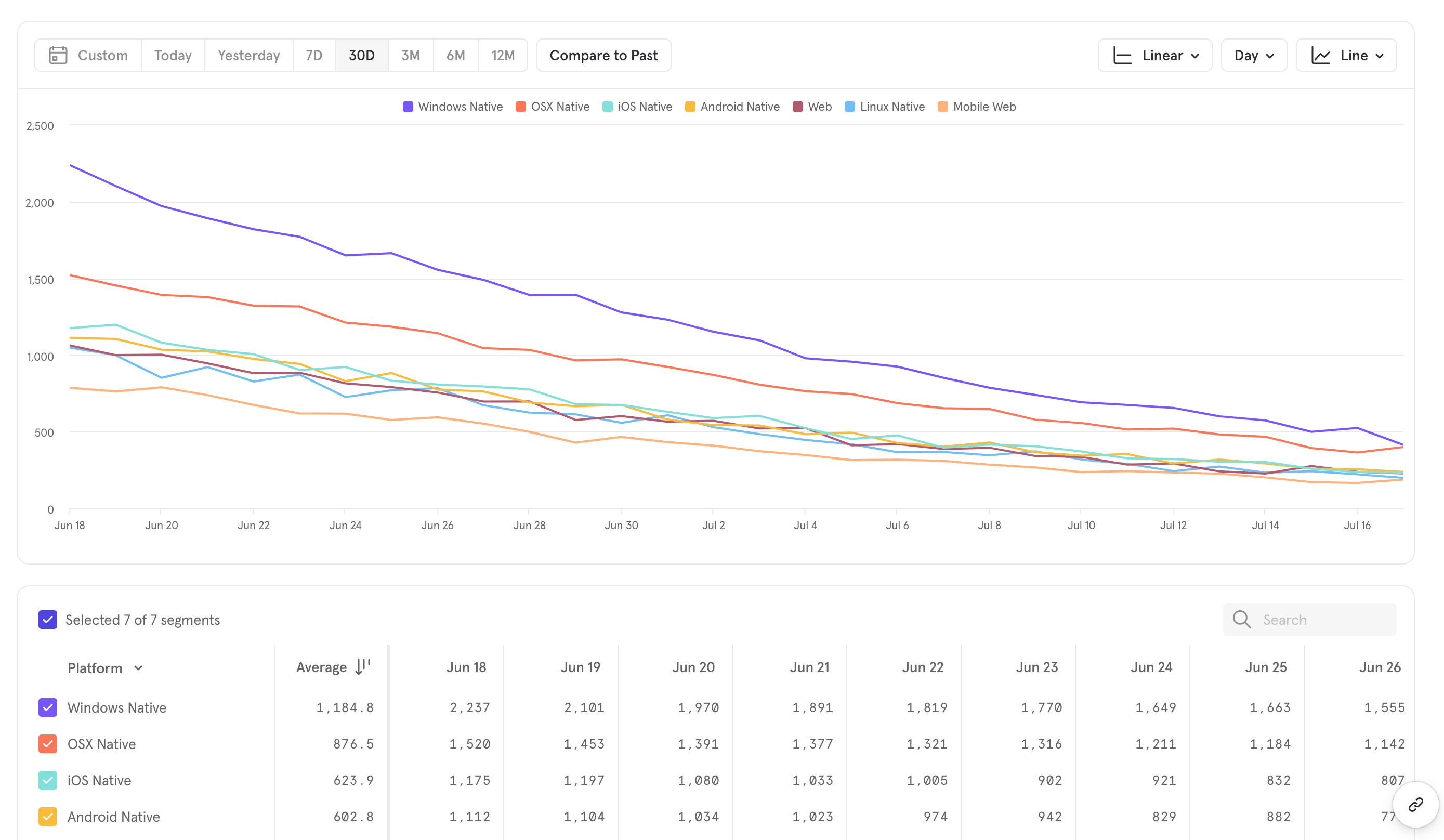
The Insights report is available on all free and paid subscription plans.
Use Cases
Here are some of the sample questions you can answer in Insights:- Product Analytics
- How is my WAU changing over time? (unique users)
- How often are my users getting value? (frequency analysis)
- What is the distribution of my users across regions/devices etc? (property breakdown)
- Lifecycle analysis
- B2B (in this case, a messaging application)
- How many messages were sent in the US in the past 30 days? (total events, filtered)
- How many users had a mobile app session yesterday? (unique events)
- How many messages are sent per session? (formulas)
- How much revenue was generated on plans purchased in the past year? (property aggregation)
- How has the power users cohort grown over the past 6 months? (cohort trends)
- Marketing
- Which advertising campaigns generate the most checkouts? (property breakdown)
Frequency Analysis
It’s important to know what’s the natural frequency at which your users use your product and experience the core value proposition of your product—do the majority of your users use your product daily? Weekly? Monthly? A16Z wrote a great article about the Power User Curve, and this video shows how you can reproduce that within Mixpanel.Quick Start
Step 1: Define your Behavior
Metrics are the basic building blocks of an Insights report, and consists of profiles (users, groups, Cohorts) or behaviors (events, Funnels behavior, or Retention behavior) along with a measurement of those entities. Press the “Select Metrics” button to add a metric. To select an event and start with an event-based simple behavior metric, choose “Events” in the left column of the metrics menu, then select the events you want to measure. This creates a simple behavior.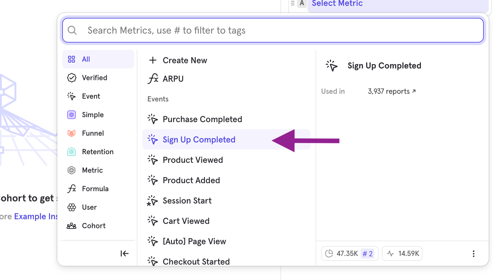
Step 2: Choose your Measurement
Once you’ve selected your behavior, you can choose how to measure that behavior. A behavior combined with a measurement forms a Metric. Depending on the type of behavior selected, Insights will default to a different measurement. If you’re measuring a Simple Behavior (events), Insights will default to measuring the number of unique users who have done that event.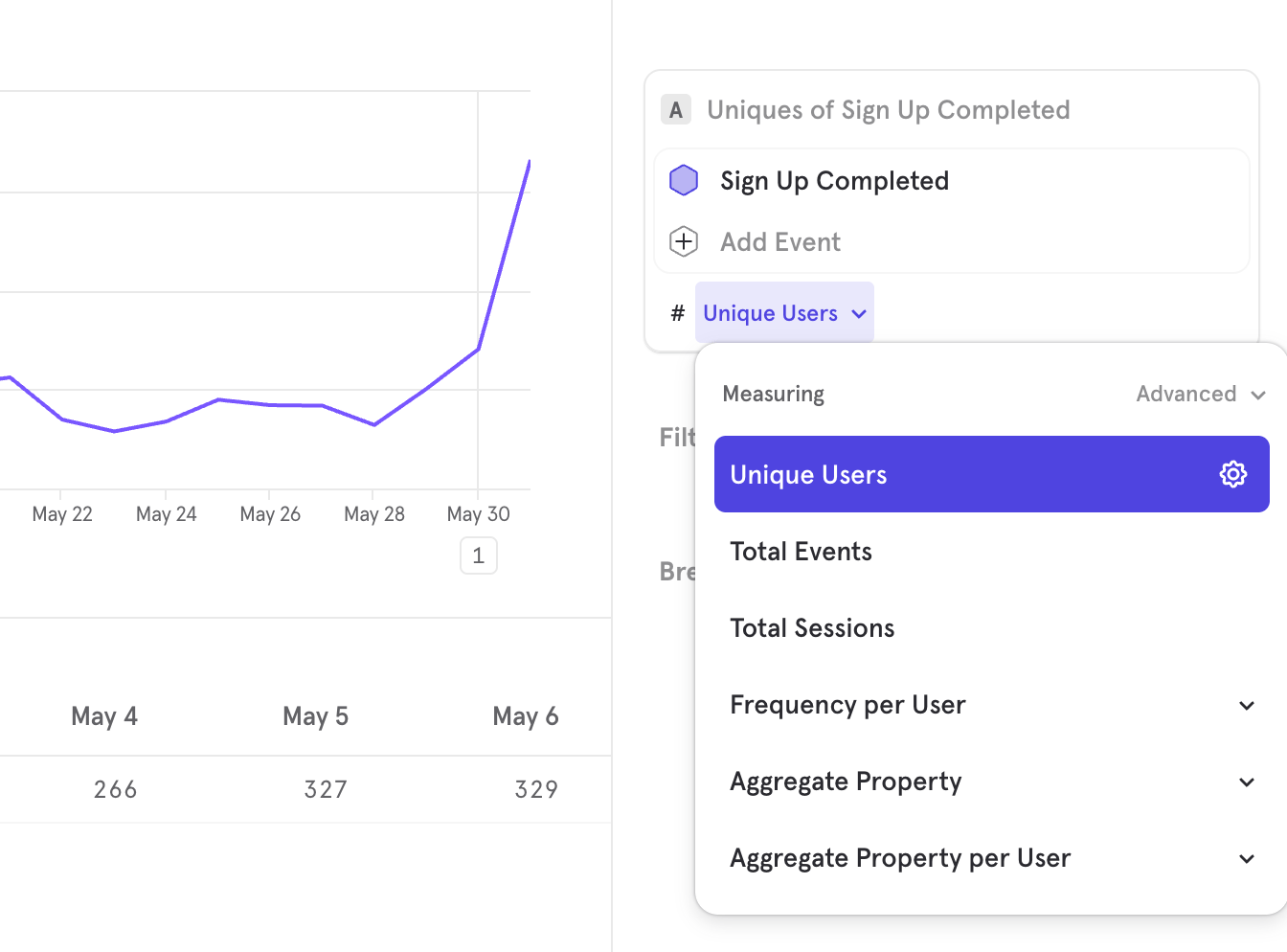
Step 3: Choose Filters
Filters exclude unwanted data. In this case, we only care about events performed on the iOS platform. Therefore, add an “Operating System” filter, where OS equals “iOS”. At this point, your query should look like this: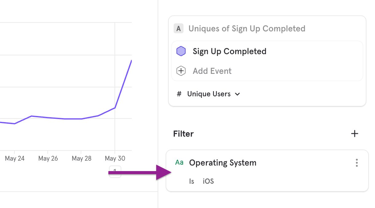
Step 4: Choose Breakdowns
Breakdowns segment data into groups. In this case, we want to count sign-ups based on users in different cities. Therefore, add a “City” breakdown. At this point, your query should look like this: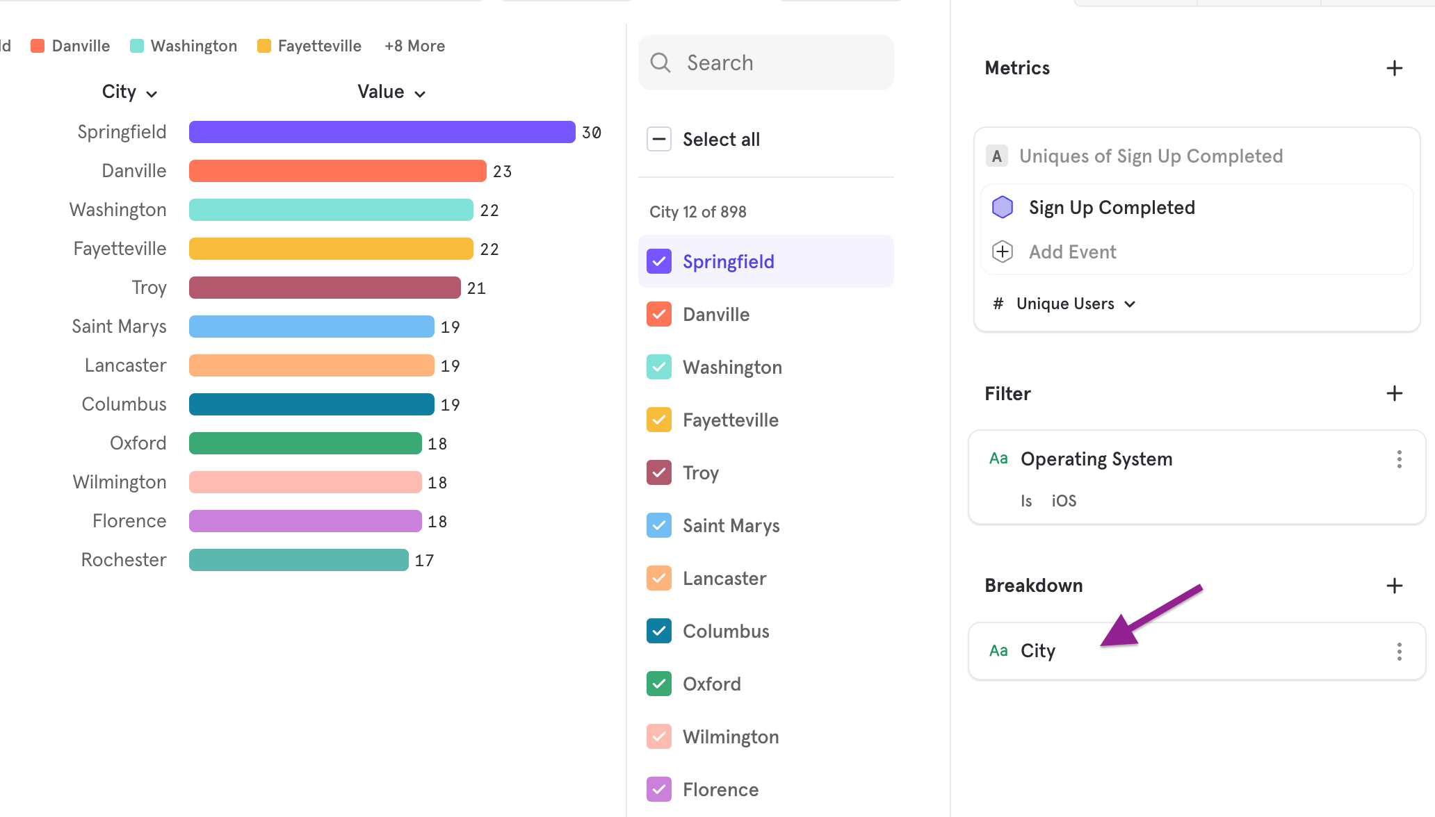
Step 5: Change Visualization
Choosing a different chart can help you visualize data better. Line charts help you see a trend, but other charts will help you see the aggregate value.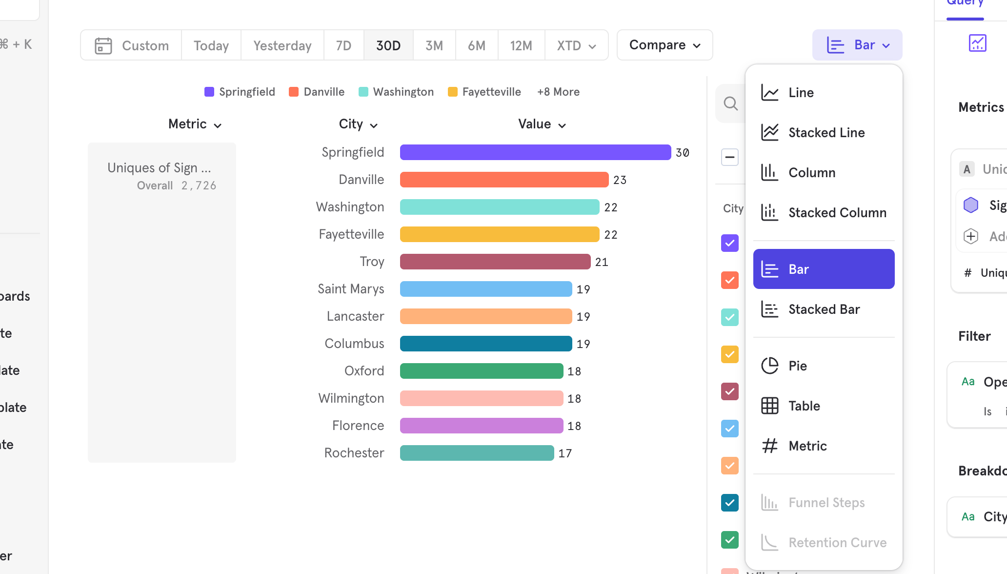
Step 6: Analyze Results
You now have a full analysis that you can use and add onto a Board, or use as a starting point to dig in further. This might mean adding more filters or breakdowns, or adding another metric and seeing if there’s an interesting comparison to be made. You could also change the counting type or the chart type.Basic Features
Metrics
Metrics are the basic building blocks of an Insights report, and consists of profiles (users, groups, Cohorts) or behaviors (events, Funnels behavior, or Retention behavior) along with a measurement of those entities. The table below outlines the types of Metrics that can be analyzed in the Insights report. Behavioral Metrics
Other Metrics
Saving Metrics and Behaviors
You can save the metric and behaviors you built and reuse them in other analysis. Select the ”…” button in the top right corner of the metric, then click “Save Metric” or “Save Behavior”. Note that saving a metric and saving a behavior is different; a saved behavior consists of the events/Funnels/Retention, while a saved metrics consists of the behavior together with the measurements of the behavior. Learn more about Saved Metrics and Behavior.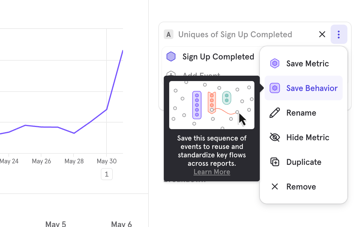
Metric Limits
Insight reports are limited to 40 metric/behavior blocks. This includes all metric and behavior blocks, such as hidden metrics and formulas. If you hit this limit, you can:- Migrate some metrics to a new report.
- Use Saved Formulas if your report contains formulas. Learn more about Saved Formulas.
- Combine multiple events into a behavior. Learn more about Saved Behaviors.
Charts
Insights feature multiple visualizations to help you view the query results in the clearest chart type. By default, Insights displays the results on the line chart, which helps you understand how metrics trend over time. However, another chart type might present the results with more clarity. In Insights, you can choose to get a metric calculated either across the entire time period selected in the date picker or on a time-segmented view of the metric (e.g. daily breakdown).- Metric calculated across the entire time period
- Bar chart
- Stacked bar chart
- Pie chart
- Metric chart
- Table chart
- Metric time-segmented
- Line chart
- Stacked line chart
- Column chart
- Stacked Column chart
Rename an Event within a Report
Click on the “three dots” icon beside an event and click Rename to rename it. This will only affect the current report, and will not change the event’s name in other reports.Sorting
Bar chart
When you view a bar chart, you have four different sorting options: A-Z Ascending, Z-A Descending, Value Ascending, or Value Descending. To switch the sorting view, select the Events or property name column header in the upper left hand of the results and then select which sorting order you would like to see.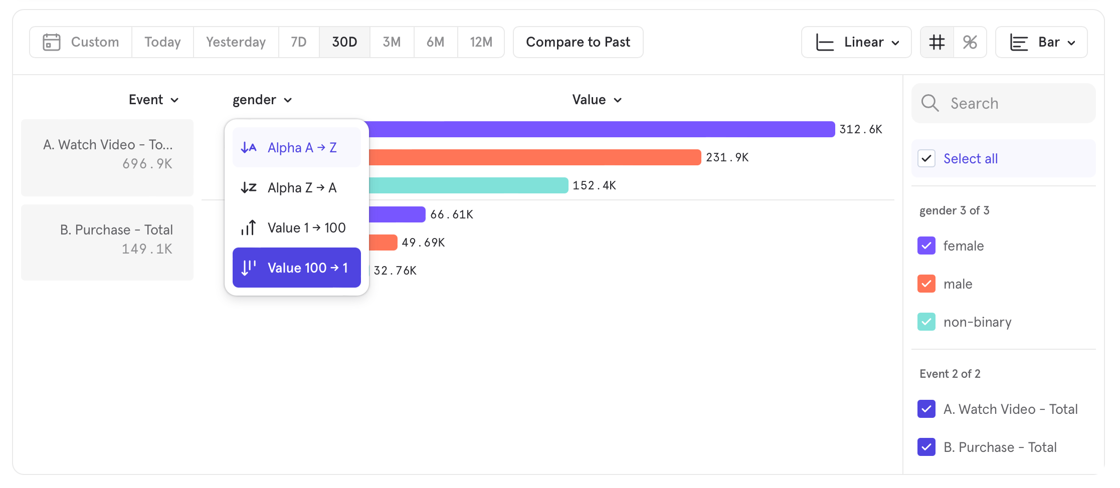
Line chart
Line charts in Insights are accompanied by a table of values that gives users another way to consume the trends information. This data table can also be sorted by clicking the column headers. Click on a column header to sort by that column. Click the header again to reverse the sorting order. For example, the table below is sorted by event counts on August 2nd:
- Segment A-Z Ascending: sort by segment name in ascending order
- Segment Z-A Descending: sort by segment name in descending order
- Value Ascending: sort by segment value in ascending order
- Value Descending. sort by segment value in descending order
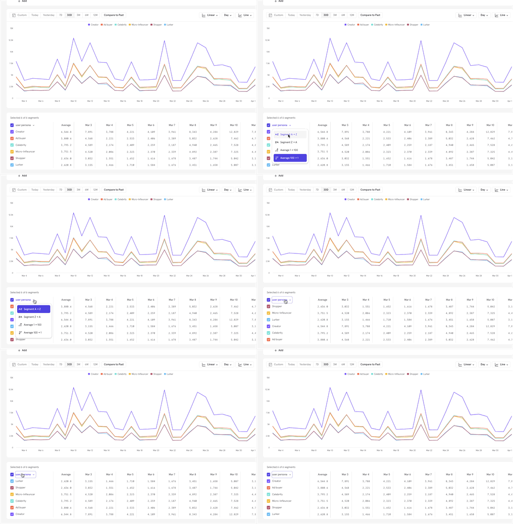
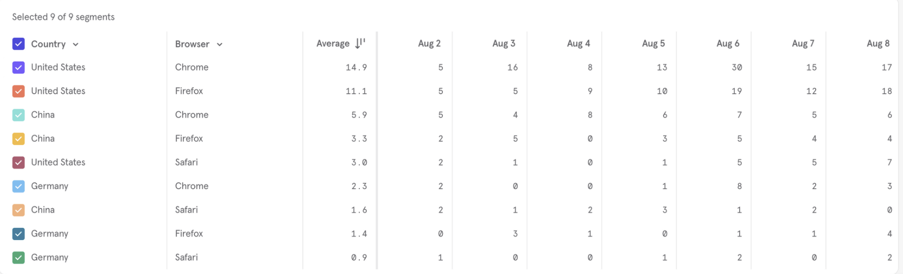
Table chart
Tables are useful to see the precise values of your data and to quickly scan multiple metrics per segment. In general, tables work similarly to the rest of Insights, with a few extra features.Sort Order
You can configure how you want rows in the table to be sorted, with our global sorting control.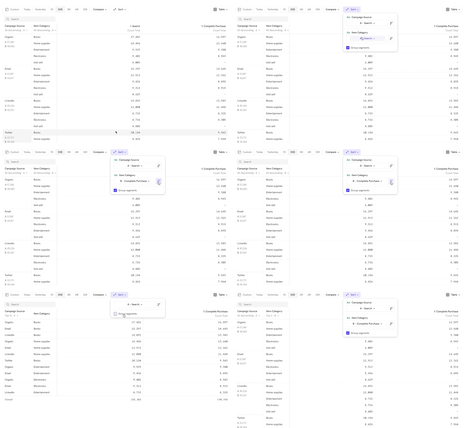
Grouped View vs Ungrouped View
The Ungrouped View removes all hierarchy and makes the table flat. Each combination of segment values is treated as a row, independently of the other rows.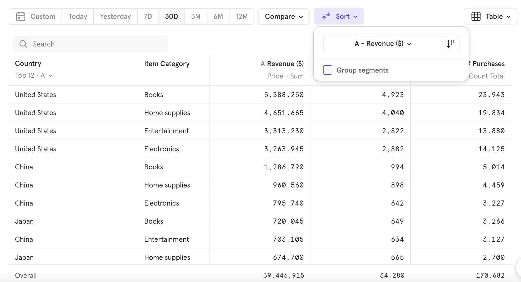
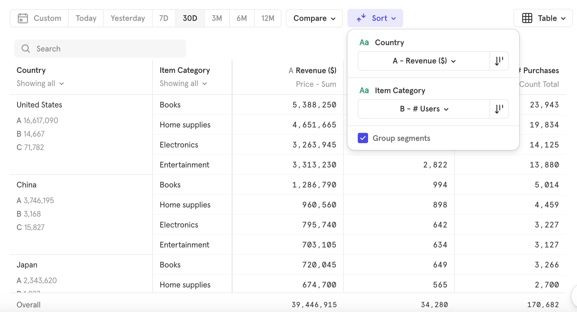
Alphabetical vs Value-Based Sorting
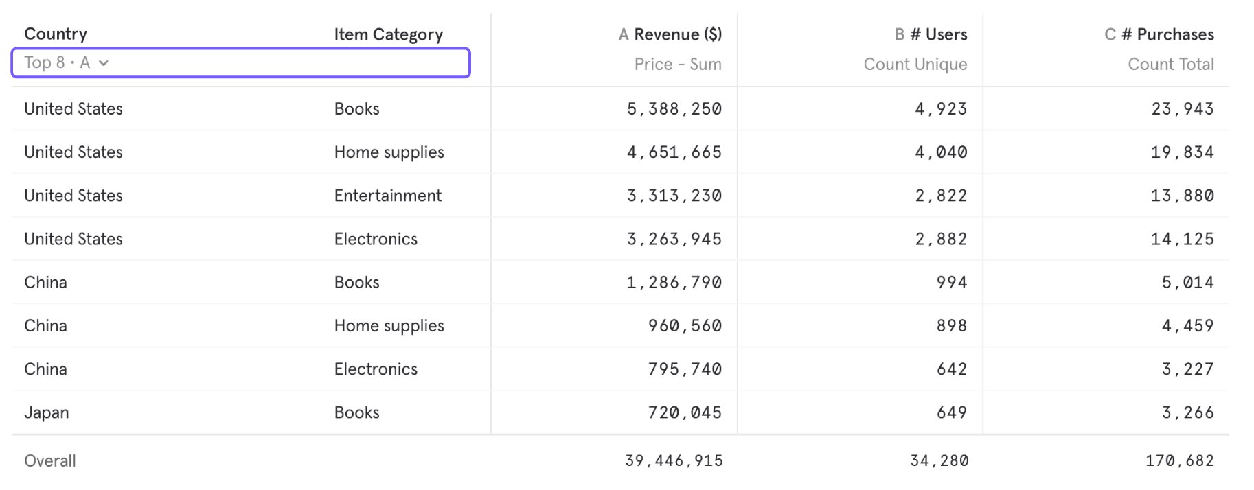
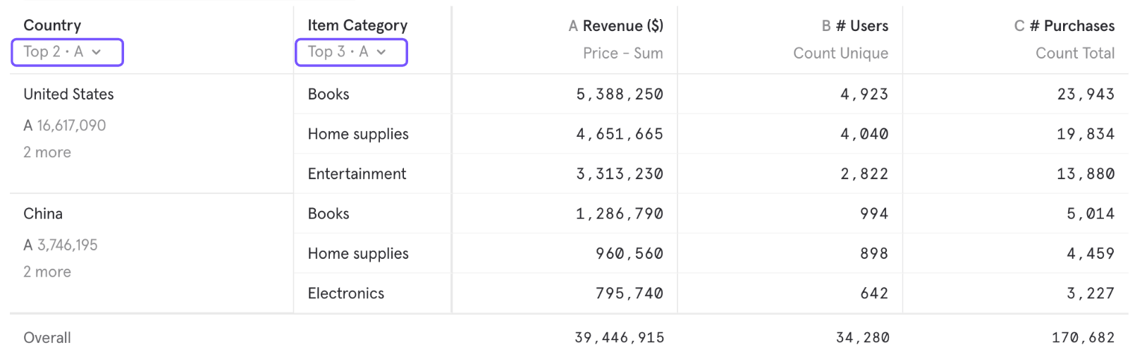
You can sort segments alphabetically or by the value of a particular metric. In the grouped view, sorting is configured on a per-breakdown level and respects the breakdown hierarchy. In the below image, we sort Country within Item Category, which respects the hierarchy.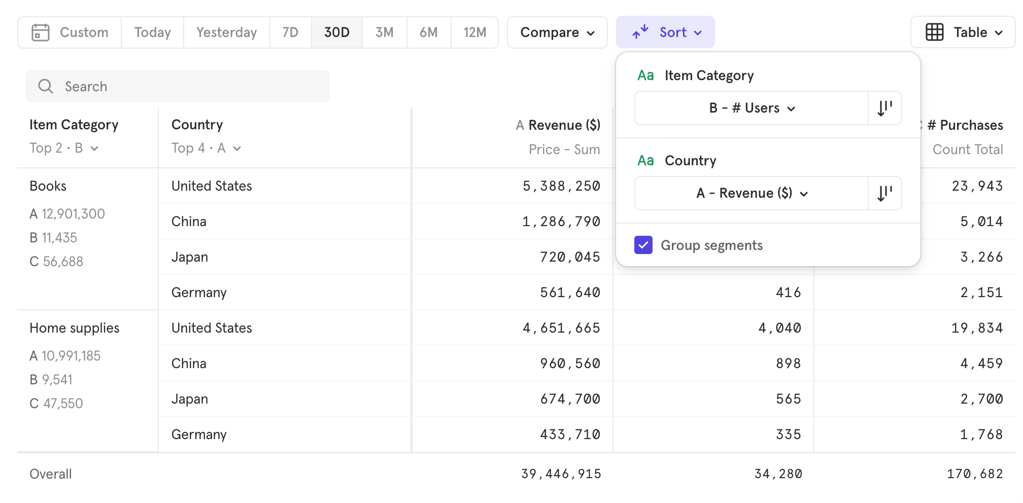
Overall and Segment Sub-Totals
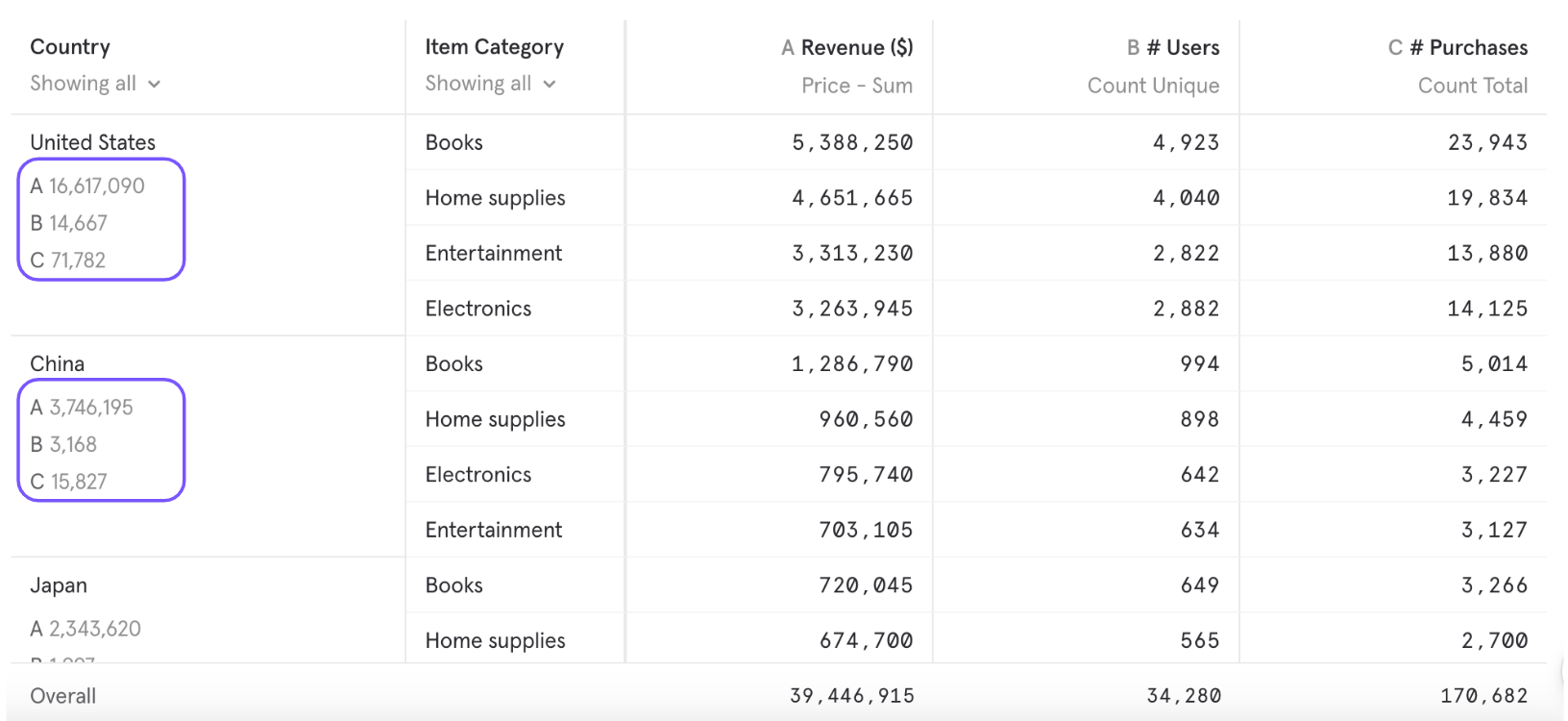
Overall: This refers to the value considering all the segments, independent of whether displayed or not based on your View N control; i.e changes to View N will not affect Overall numbers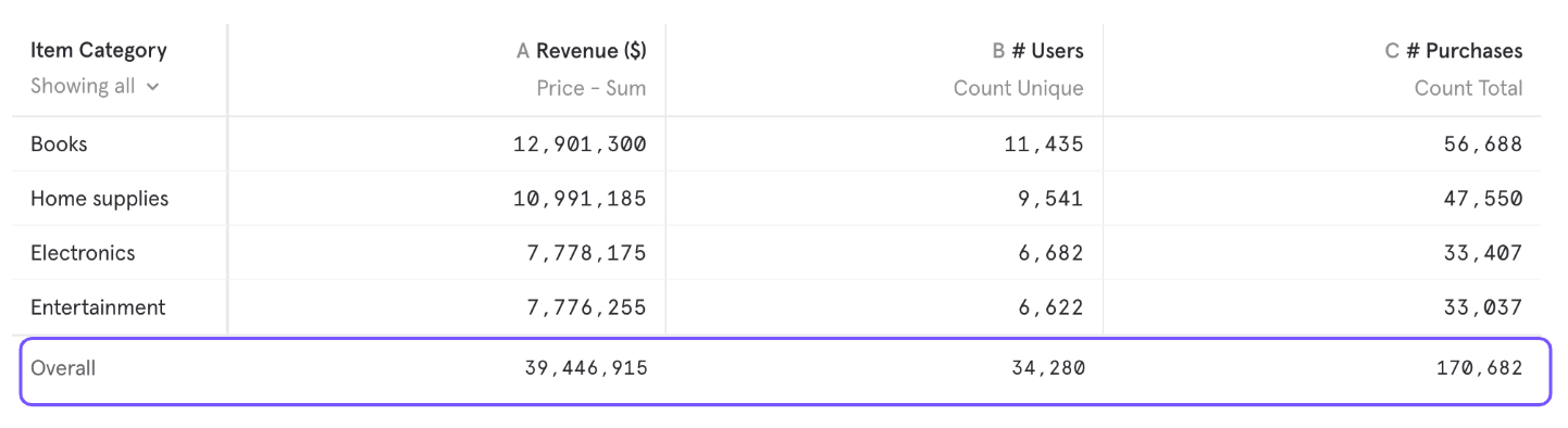
Dynamic & Manual Segments
Dynamic Segments let you decide how many segments to display per breakdown in your report. With Dynamic Segments, the segments selected in the report will change based on your latest data and the current sort order. Manual Segments let you choose specific segments that will always display in the report, regardless of the data or sorting.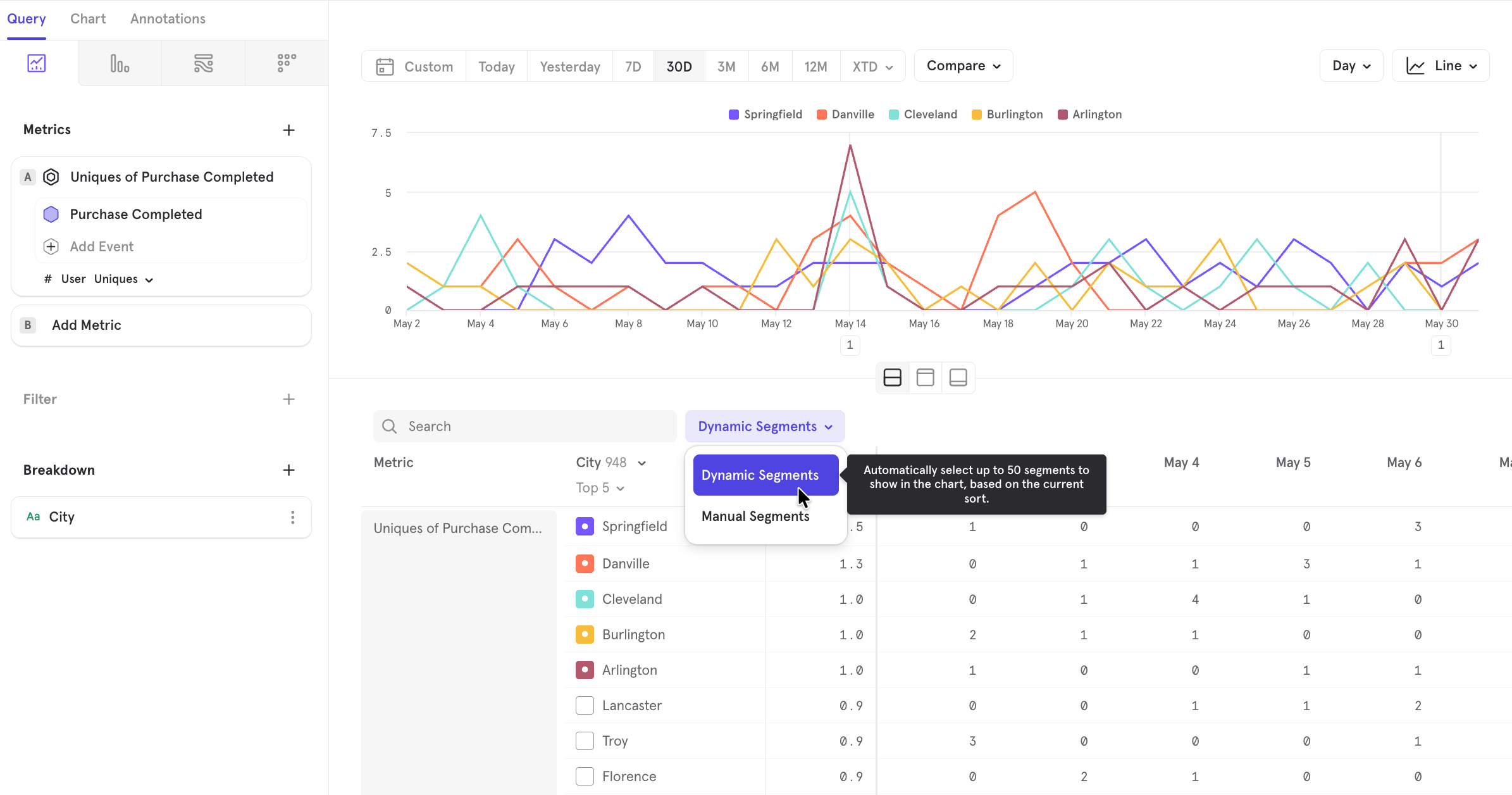
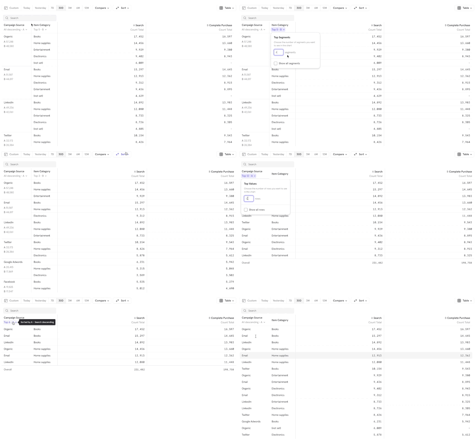
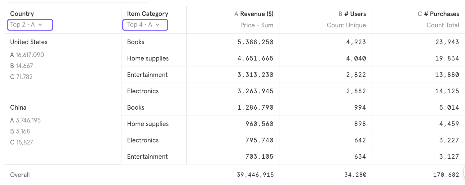
- View N only controls how many segments to display. To decide which segments to display i.e if it’s the top segments by value or bottom segments by value or alphabetical, please change the “Sort Order”.
- View N will show the minimum of N and how many segments are in your report. For example, if you set N=10 but you only have 7 segments, we will only show 7 rows.
- When selecting “Show All”, the maximum number of segments displayed in the UI will depend on the chart type.
Advanced
Formulas
Use Formulas to make calculations using simple arithmetic operators. Mixpanel supports the following operators:- + : Add
-
- : Subtract
- * : Multiply
- / : Divide
- () : Use parentheses to influence the order of operations
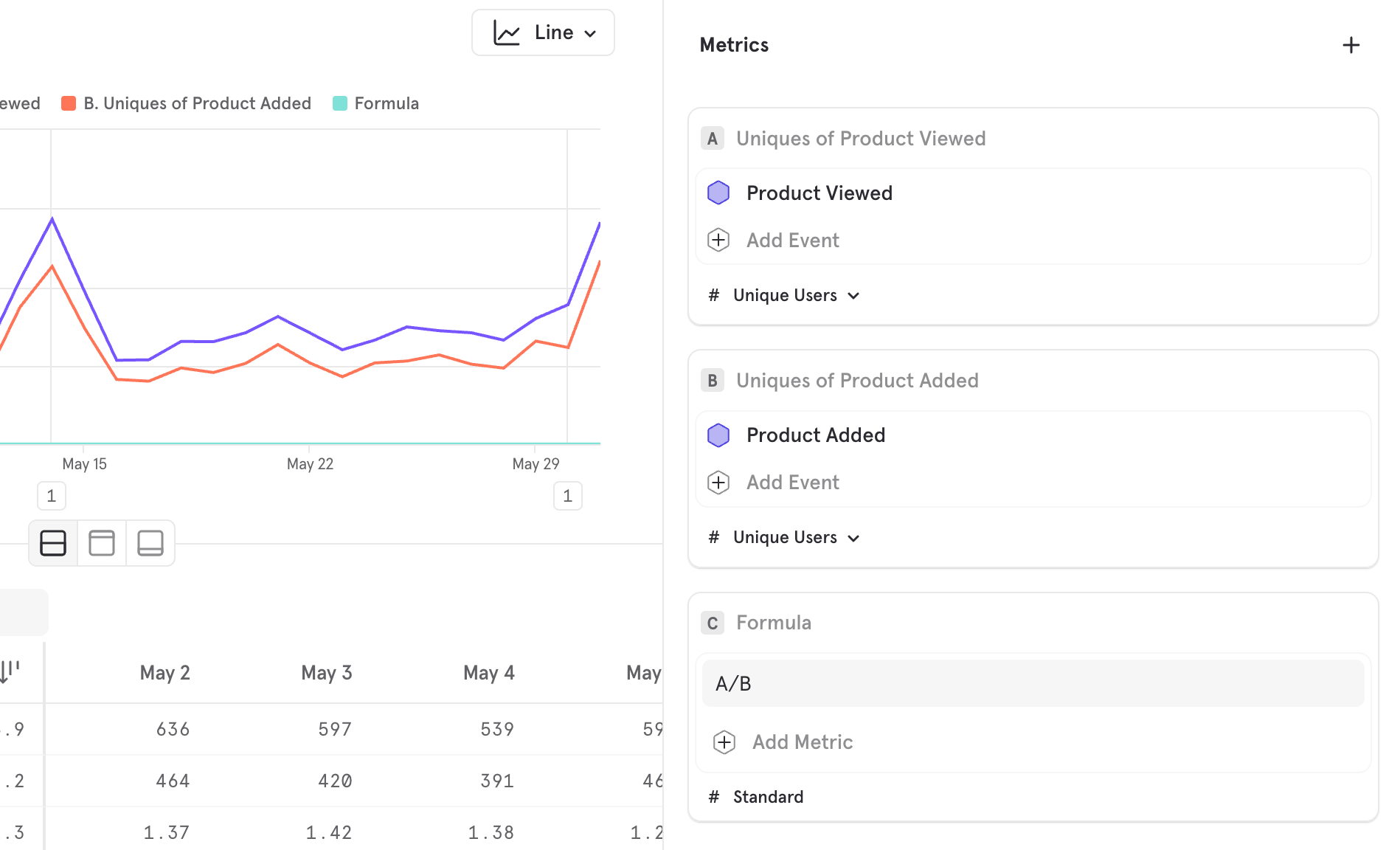
Save formulas for re-use
Users on an Enterprise or Growth plan can save Formulas for reuse. Free users can create Formulas locally within a report but cannot save them. See our pricing page for more details.
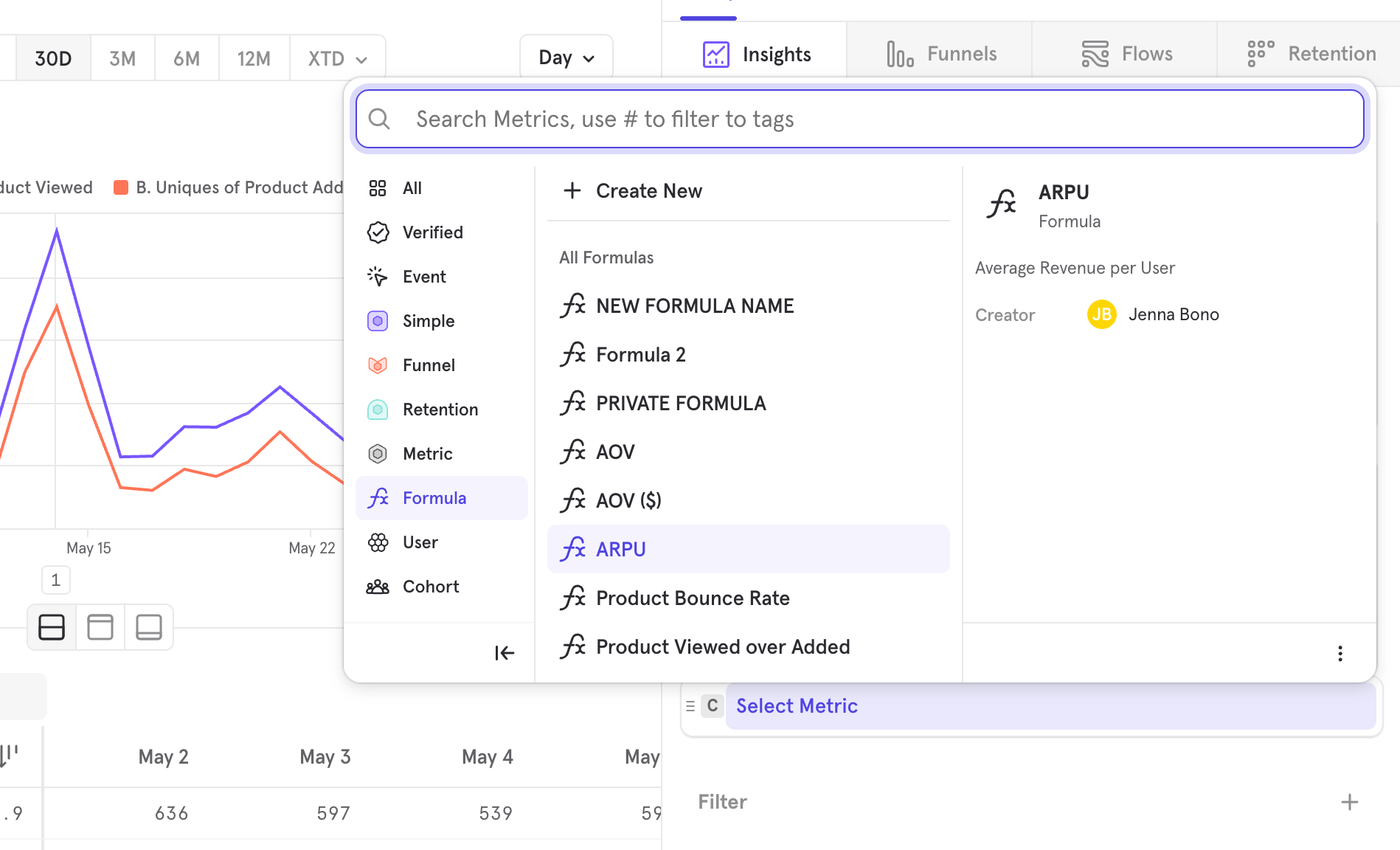
- Once you save a formula, A,B,C refer to what’s within the saved formula modal
- To edit a saved formula, expand the metric and edit inline, and then save
- When a saved metric is updated, it will update across all reports it’s being used in
- A saved formula can’t reference another formula
- All roles can create a saved formula, but only some roles can share them with the whole project for re-use
- You can only look at saved formulas created by you or shared with you
Custom Bucketing
Insights will automatically group your high-cardinality segments into buckets. Buckets can be edited by using the “Custom Buckets” option in the overflow menu: You can choose “Even” to get buckets of uniform size, and you can choose “Varied” to get buckets of different sizes. This helps with organizing outliers, or with drilling deeper into particular ranges.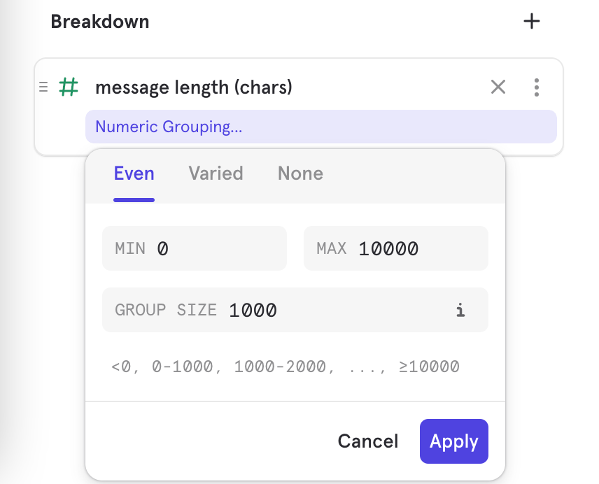
Time Period Comparisons
Compare the current period of time to previous periods to track trends and growth in your product’s use. Compare traffic from a specific campaign period or event from one year to the next, or compare the success of that campaign to your normal traffic. Note that if a data point for a previous year falls on a weekend, the data point is automatically moved to the next Monday to give a clearer picture of the data change from one year to the next. Click on the Compare to past button at the top of your Insights graph and select the time period you wish to compare to. You can also select a custom date range.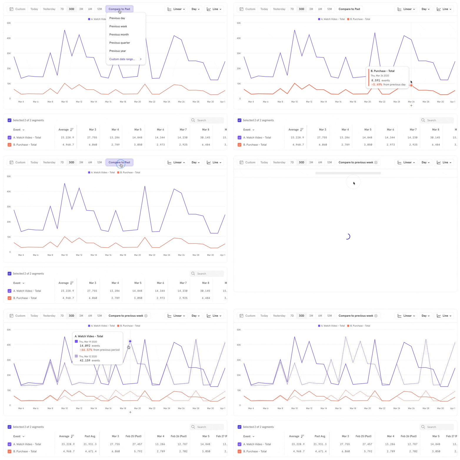
Value Comparisons
When you have multiple metrics, or have broken down a metric by a property, you can compare them against each and the relative value. Click on Compare -> Overall. This works for all measurements. For a “totals” measurement, you can see the percentage that a particular segment makes up. For non-sumable aggregations, it compares the segment value to the whole, unsegmented value.
Profile Analysis
Profile metrics allow you to access profile data and visualize your users with filters and breakdowns based on their profile properties. When exploring Profiles, you are always analyzing all user profiles. Select the Measurement you want to use to calculate results by clicking on Total and selecting an option from the drop-down. You can calculate based on users or profile property value. Link to DemoAnnotations
To clarify the results in your Insights report, add detailed annotations directly to your time-series charts (such as line, stacked line, column, and stacked columns charts). Annotations are tied to a specific date on the chart, rather than a particular point of data on the chart. Learn more about Annotations.Measurements
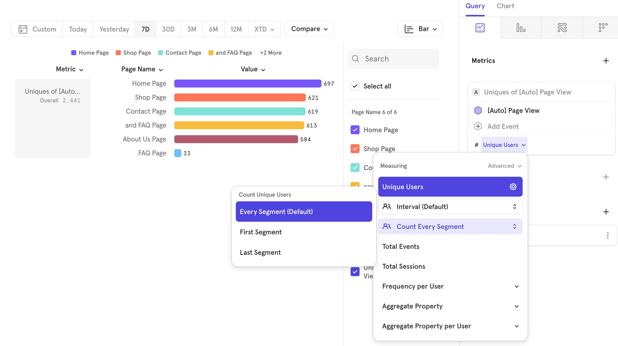
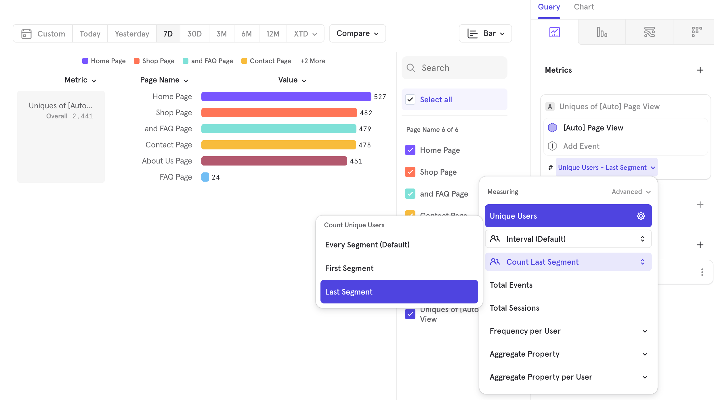
Link to Demo Measurements in Mixpanel reports allow you to perform more complex calculations on your queries - this includes computing aggregate values of your event and property data, including totals, uniques, and averages. The following measurements are only available in Insights, and are separated into groups based on what is being calculated: Total, Unique, Count users, aggregate property values, aggregate property values per user, and count sessions. Select the measurement you want to use to calculate results by clicking on Unique Users and selecting an option from the drop-down. You can calculate based on events, users, event property value, event property value per user, and sessions.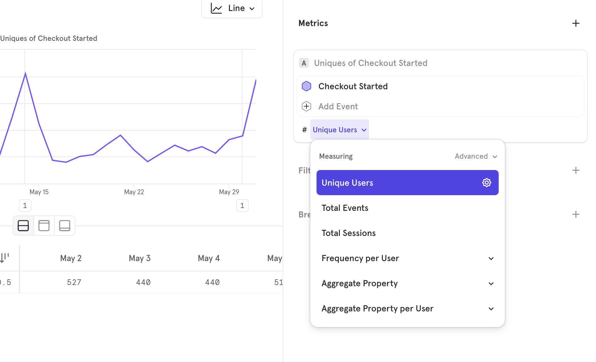
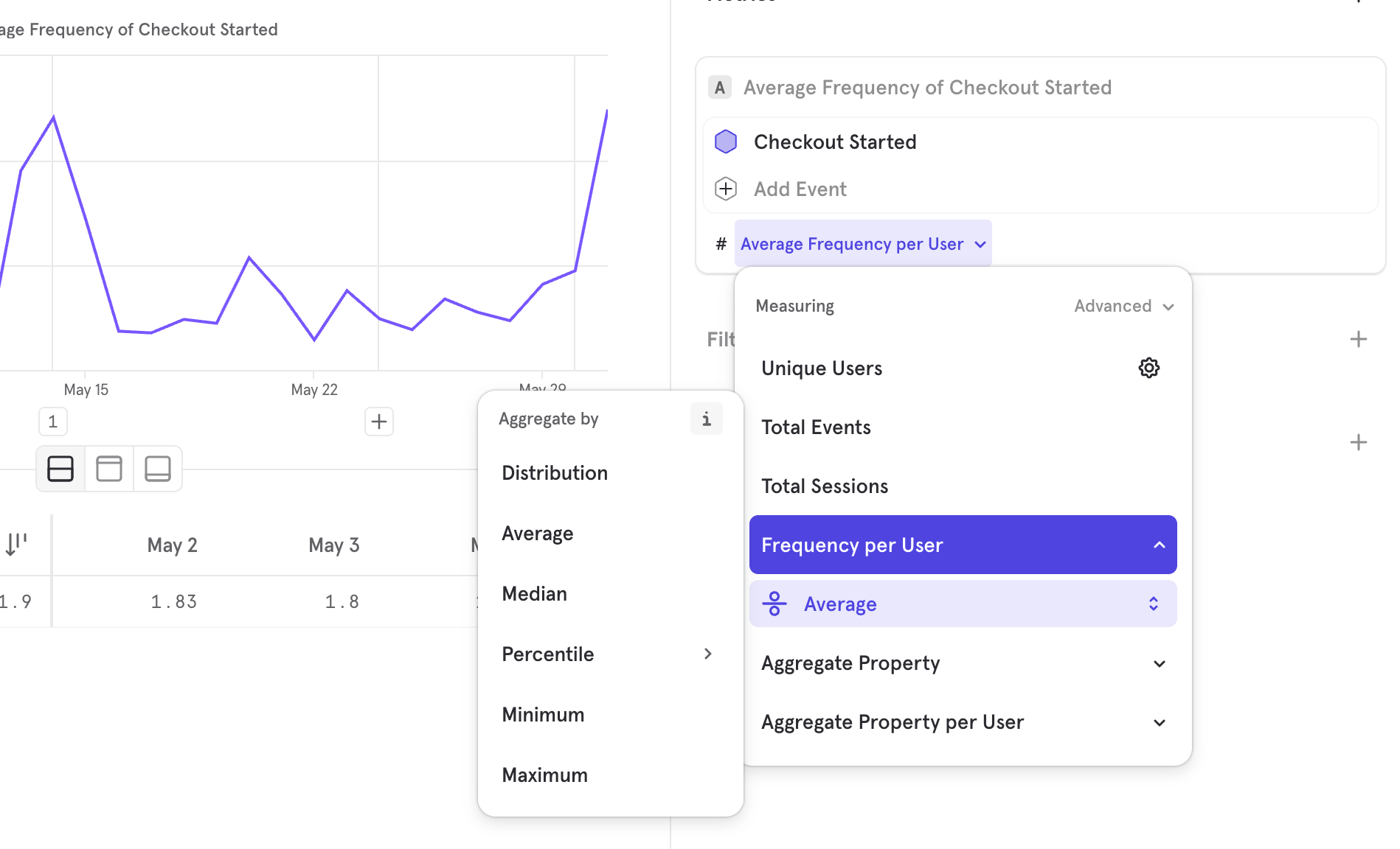
These functions provide additional aggregation options following the initial calculation because they are “per user” calculations. “Per user” calculations first calculate the value per user, which is an unhelpful query in its raw form, but becomes useful when you perform an aggregation on that calculation.
Selecting any of these functions gives you the option to choose different ways to aggregate this data. The default aggregation is Average, which you can click on to select a different option such as distribution, median, 25/75/90th percentiles, minimum, and maximum.
Events
Users
This can refer to measuring the total number of user profiles, as well as the number of unique users that performed an event. DAU, WAU, and MAU are accessed through the advanced settings of unique users. Select the > arrow to choose any XAU options. If you select the DAU, WAU, or MAU function for a date range that includes the current day, the query will take the end of the current day as the end of the query’s time segment (even though it’s in the future). For example, today is April 25th, and it’s 4:22 PM. If you make a query to show WAU and you select “current day” as your date range, the query will return the count of unique users between April 19 at 12:00:00 AM and April 25 at 11:59:59.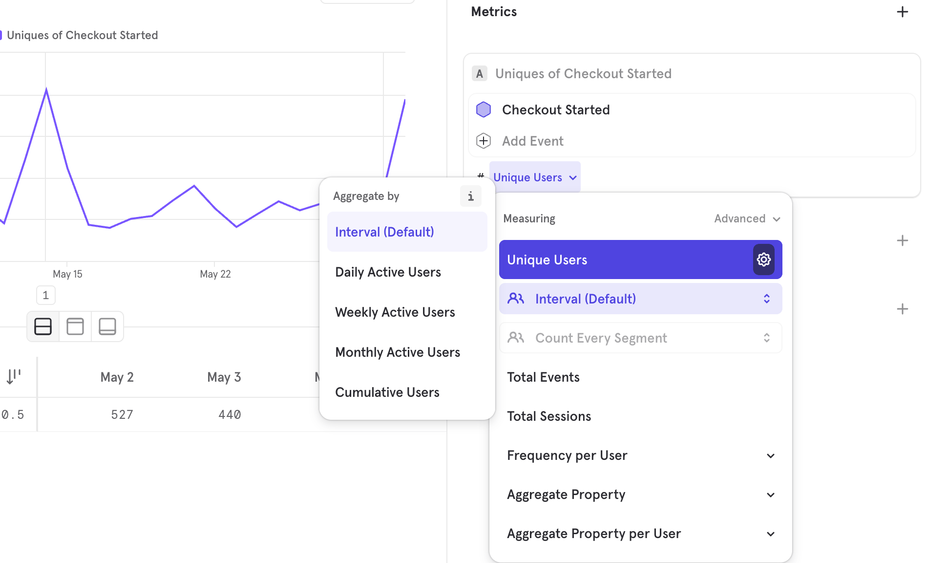
Example of MAU
Assuming we would like to find the MAU of the last 6 months (e.g. Jul 5, 2023 to Jan 1, 2024)
- If the time interval is “Month”: https://mixpanel.com/s/3LC8ll
- For each month, we will look at the last date in the time frame, and count 30 days back from that.
- So for the month of Dec, we will count the total number of active users from Dec 2 to Dec 31
- As long as the user watches video once, anytime between Dec 2 to Dec 31, they will be counted as part of the MAU for Dec
- If the time interval is “Day”: https://mixpanel.com/s/47YhnE
- For each day, we will look at the last date in the time frame, and count 30 days back from that.
- So for Nov 1, we will count the total number of active users from Oct 3 to Nov 1
- As long as the user watches video once, anytime between Oct 3 to Nov 1, they will be counted as part of the MAU for Nov 1
- If the time interval is “Week”: https://mixpanel.com/s/dA5BK
- For each week, we will look at the last date in the time frame, and count 30 days back from that.
- So for the week of Nov 27 to Dec 3, we will count the total number of active users from Nov 4 to Dec 3
- As long as the user watches video once, anytime between Nov 4 to Dec 3, they will be counted as part of the MAU for Nov 27 to Dec 3.
Aggregate Property
Aggregate Property per User
Total Sessions
Additional Aggregation Option Examples
Here’s a quick overview on “Distinct count” of property values, and how that differs from “Distinct count” of property values per user:
Here are some use cases that are now possible with “Distinct count” of property values:
- How many unique items were added to cart yesterday?
- How many unique songs/videos were played in the last 30 days?
- How many unique files were worked on in the last week?
Analysis Settings
Allows you to change the metric being measured. Access by going into the advanced section of the measurement menu.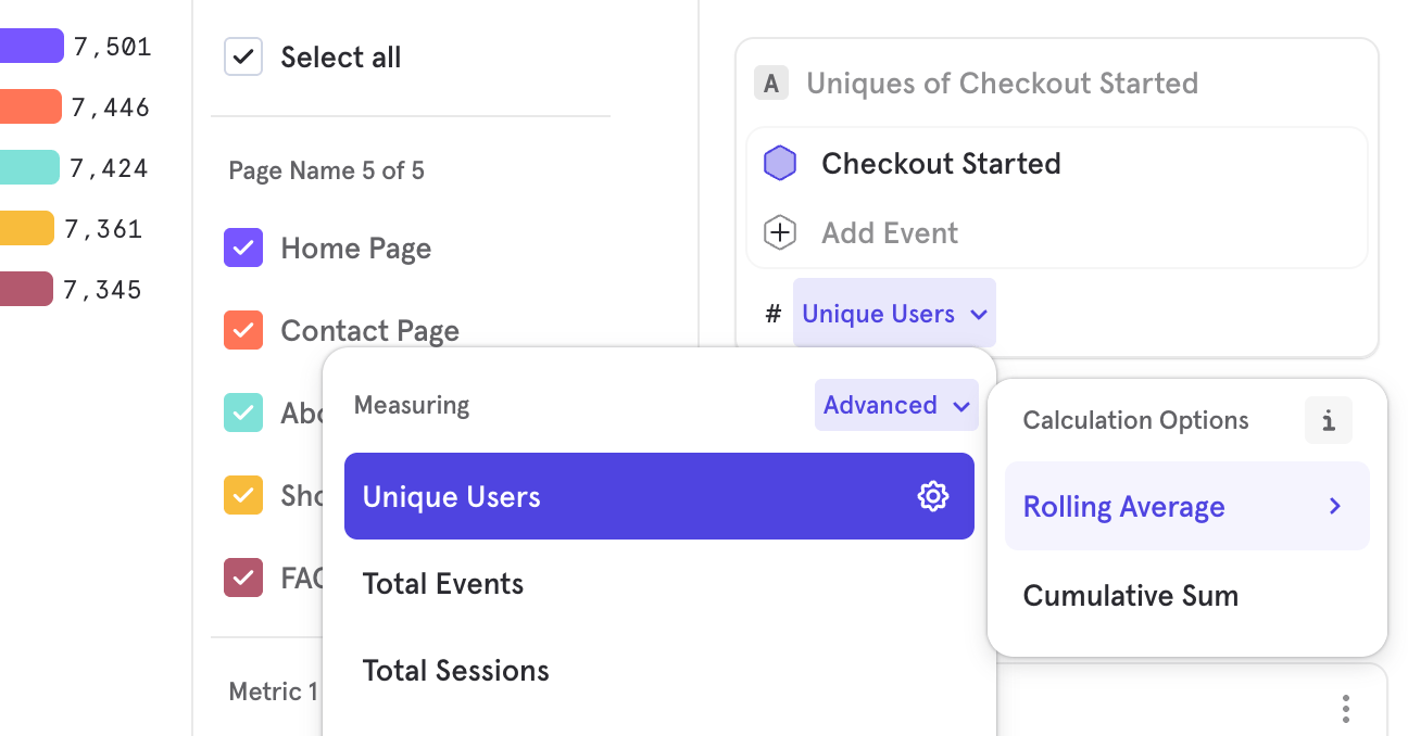
- Rolling Average: Rolling analysis calculates the rolling average of the data set. A rolling average curve is a series of averages from subsets of data. Use rolling average analysis to remove noise or spikes from data and smooth out trends over time. Mixpanel calculates the rolling average based on the selected time interval (hour, day, week, month, or quarter) for each data point in the graph.
For example, if you make a rolling analysis query for the past 30 days, Mixpanel calculates the rolling 7-day average by default. The value reported on each day in the line graph is the average of the values from the 7 days leading to that day. In the case of the first 6 days in your selected time period, the 7-day-average calculation will include days before the selected time period. - Cumulative: Adds up the values of each point on the graph as it goes along, so the height of the line will increase over time.
View Users
Click a segment in an Insights report to see the list of users that underlie that data point. This helps see a representative sample of users from any analysis, so you can drill into anomalies or simply get to know your users. You can also save this user list as a cohort to either export or use for message targeting. See this video walkthrough for examples of how View Users can help you understand users contributing to a specific metric.View Events
Click on a chart segment in Insights and view the raw events that made up that metric. You will be redirected to the Events page.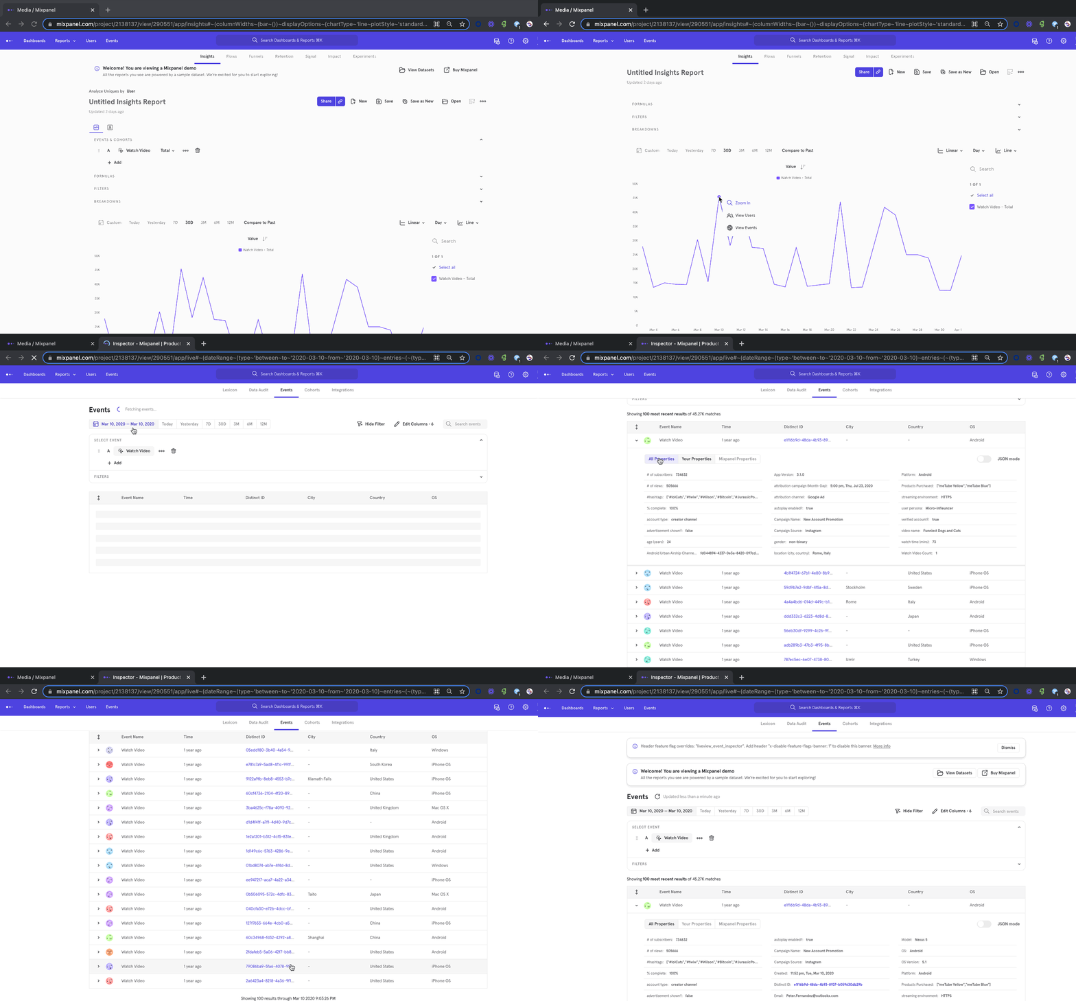
View Sample Events
You can hover over any event and in the context panel, you now have the ability to “View Sample Events”, which redirects you to the Events page with the 100 most recent samples of that hovered event: You can see a few samples of an event to help you decide whether that’s the right event you want for your analysis or which property you should use for filters/breakdowns.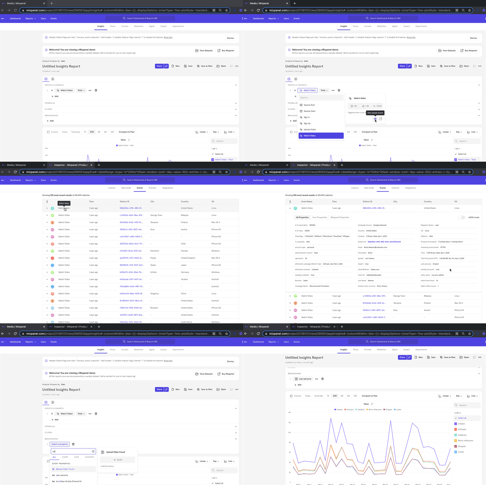
Date Range Guardrails
To ensure a smooth self-serve experience and fast query performance, certain date-range guardrails apply depending on the type of report you create:- Hourly granularity reports can include a maximum date range of 31 days.
- Daily granularity reports can include a maximum date range of 12 months.
- Reports using All Events can include a maximum date range of 93 days (approximately 3 months).
- Reports using cohorts can include up to 93 time intervals—for example, 93 weeks or 93 days. This allows queries such as “the last 3 months at daily granularity.